Pitchbook + Personas
—CASE STUDY
User Personas, Scalable Design Systems, Print Design, Layout, Modular Content, Photo Direction
First impressions can make or break a pitch… so how do you scale them across 150 people in 3 very different markets? Building on our newly established web branding, we created a locally-minded product with national appeal.
MORE INFO
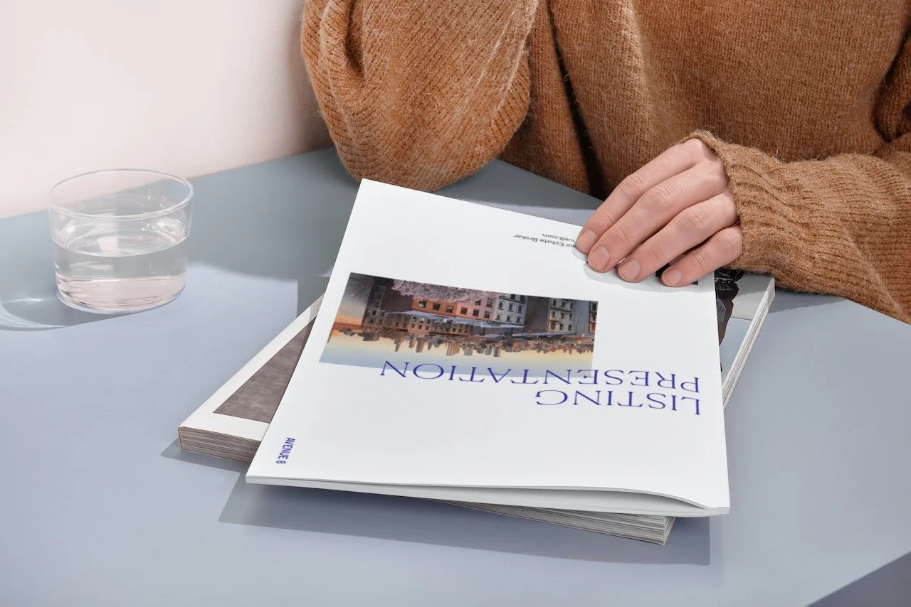
Avenue 8 is a digital and mobile-first residential real estate brokerage for modern real estate agents.
CREDITS
Brand Director Taylor Bennet
Editorial Director Patrick Heij
Senior Designer Sarah Menard
Jr Designer Anthony Aguilera
Built in Figma + Design Huddle
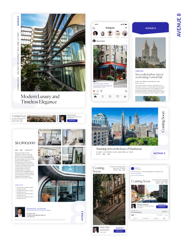


Local imagery adds oomph to standardized print layouts, while sleek animations take the digital experience to the next level.


Overview
A listing presentation is the agent’s chance to pitch their services. Good presentations build trust, offer strategic support, and help forge a personal connection. Really good presentations not only land the job, they also have the power to convert potential buyers or sellers into lifelong clients.
The Challenge(s)
The existing presentation was outdated, full of tech-y startup jargon and regularly-deleted pages.
Each region required a unique offering, but our team had limited bandwidth to devote to the project.
Folks were going rogue after months of delays— real-world collateral was disjointed, last-minute, and didn’t reflect the newly evolved brand. We needed a solution so intuitive, everyone would be excited to jump back on board.
Each region required a unique offering, but our team had limited bandwidth to devote to the project.
“My clients want to hear about the amazing ways I’ll sell their home — not our investors.”
— Client feedback
Solution
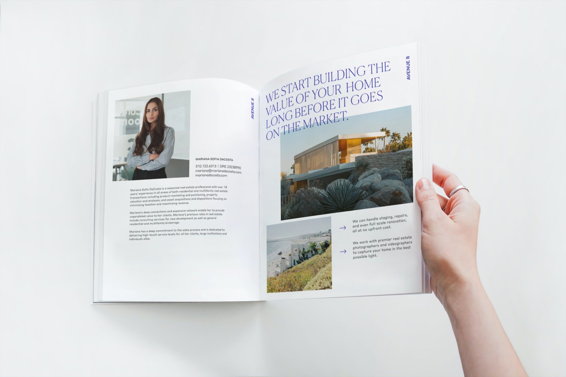
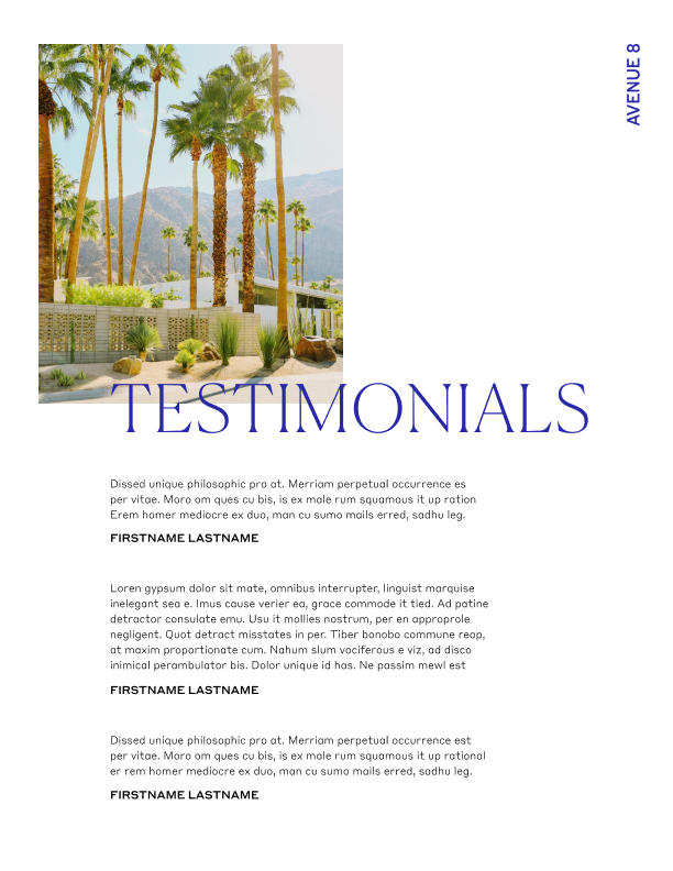
A new presentation featuring evocative visuals and precisely targeted content, rooted in hyperlocal regional profiles.
Out with the tech-y language, in with aspirational lifestyle messaging and strategic business offerings.
A personal, efficient experience that populated standard layouts with hyper-local imagery, added animations to the digital decks, and included local vendor recommendations tailored to each region. Positive feedback flooded in!

Approach
Exploration
Researched comparable offerings on the market, interviewed clients, and reviewed per-page usage stats from the previous iteration. All the good due diligence.
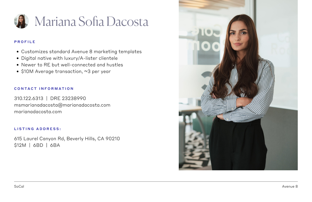
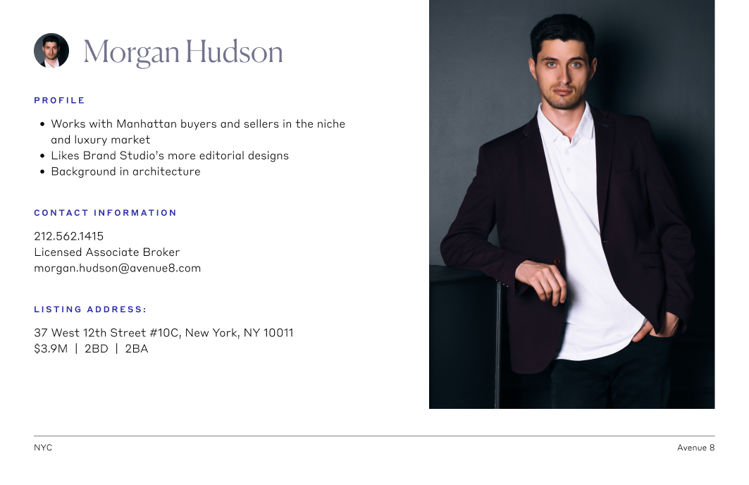
Collaborated with regional directors to craft agent personas that embodied such a deep sense of place that flipping through the pages felt like coming home. Whether home means a 5-floor walkup in Brooklyn or a palm-shaded Laguna Beach bungalow, that local-only familiarity was key.

DESIGN
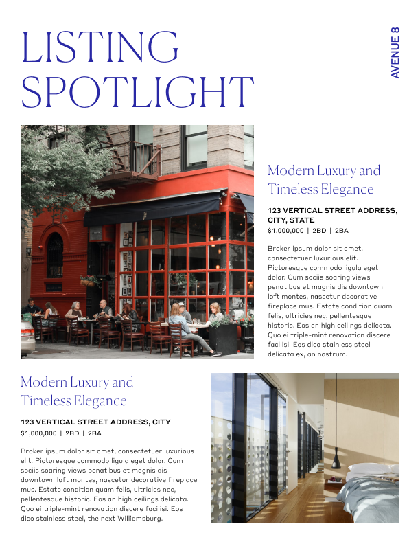
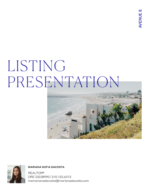
We built the print presentation first, scaled to digital, then tailored content to each market: NorCal, SoCal, and NYC.
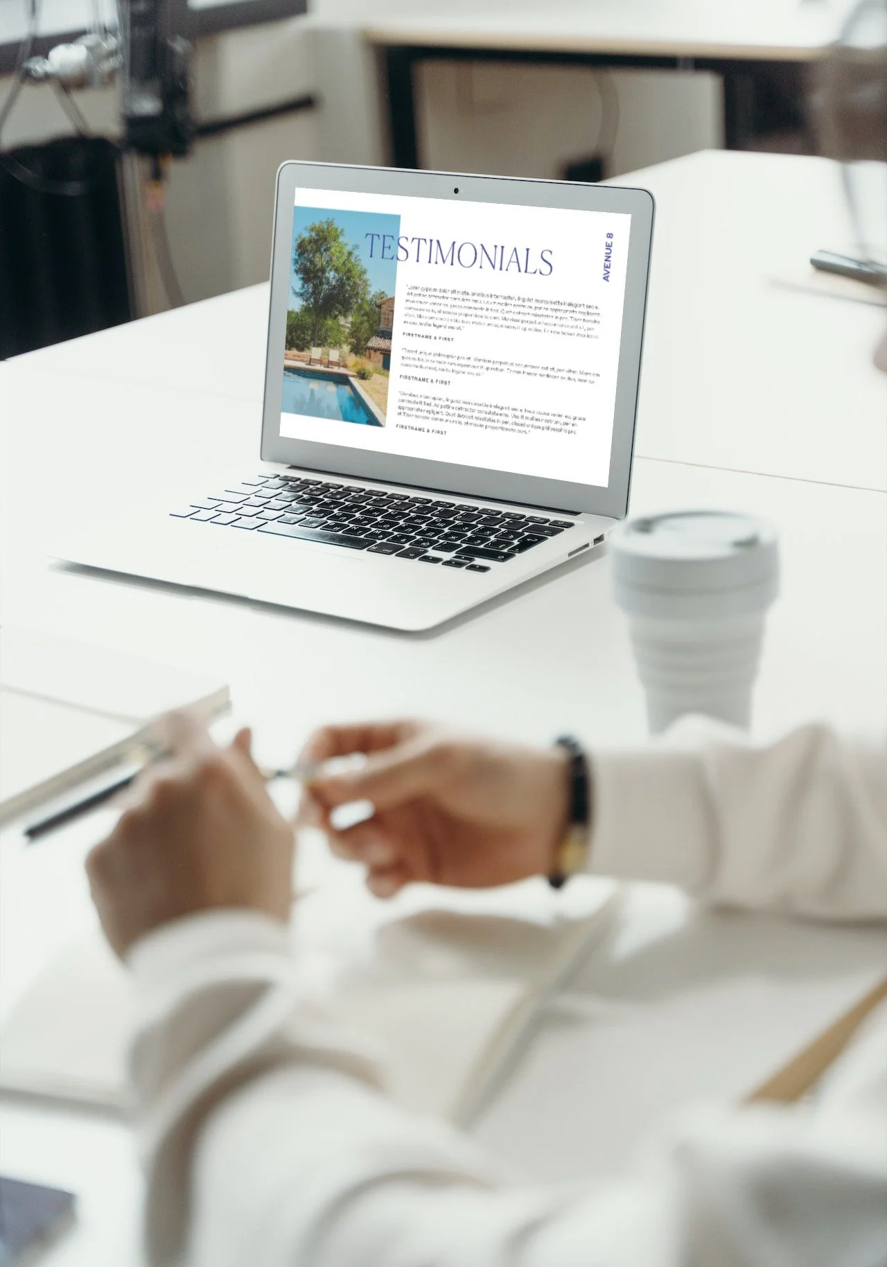
Designs needed to shine regardless of presentation format. While the digital designs feature the color blocking and full-bleed photos that are a big part of our brand language, print-friendly designs are mostly white, with smaller photos and a clear margin around the border to accommodate printer limitations. We also designed the decks to be modular — no double trucks here! Users can drop, add, and reorder pages in both digital and print formats without disrupting the overall flow.
Learnings
Boots on the ground are critical. Designs launched nationwide, and we partnered with folks in each region to pinpoint the best strategy for their audience. In pedestrian-centric New York, for example, we built a tablet-friendly digital deck after learning nobody prints things because paper is too heavy.
Don’t let better be the enemy of good. Every time we were almost ready to launch, something pushed back the release date. Small updates over time instead of one grand reveal could have prevented a lot of frustration.